


When onboarding users into your AR experiences, first impressions matter. Regardless of the “cool factor” of your technology, device, or app—the design choices we make about the viewer’s first few moments in augmented reality will determine their overall success and enjoyment in AR.
As an XR designer and researcher, I’ve helped scores of users start up their first experiences in AR. Watching users struggling inspired me to build a collection of training experiences that introduce some core ideas of 3D interaction in mobile AR. I tested these apps with workshop participants, improved my prototypes with their feedback, and now, I’m glad to share the insights from this process with you.
Download Torch AR from the Appstore to try these ideas for yourself.
This article assumes you are comfortable navigating and using the Torch Design Environment, have built some scenes in Torch and have tested your app in Play Mode. If this is your first time building with Torch, read my guide to getting started with Torch, first.
After reading this post, you’ll understand a few approaches for arranging assets in a Torch AR project. On the way, I’ll show you how to present additional information to guide the user, and how to strike a balance between using text and visualizations all while building an engaging, welcoming experience in augmented reality.
Pro-tip #1—Clearly define your interaction space
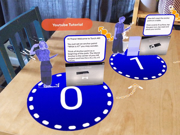
In Torch, the World Anchor is the center of experience and in most cases, it’s where a user will expect your app to start. Place your first object (or cluster of objects) at, or near, the World Anchor make sure to provide clear directions about what to do next.
Background
While designing an onboarding app with Torch, I noticed that immediately upon starting the app many users would freeze up. Knowing this I began thinking about design layouts and eventually settled on a circular design. I even plotted a graph to approximate the position values I would need.
Later with feedback from users, I realized that my layout concept was close, but not yet a perfect user experience. If a user dropped an anchor further than 0.5 meters away, they would end up outside of my interaction space. Conversely, if the world anchor was placed too close to the viewer, the content would present in an uneven, uncomfortable experience.
In order to fix this, I landed on a spiral design based on the Golden Mean instead of a closed circle. With this layout, I can ensure that the user is always at the center of the content and that their next step is clearly in view.
Pro-tip #2—Guide your users with prompts and UI cues

Information displayed in Augmented Reality should be positioned in augmented space using the same principles we would use in the real world. Show hints in context, guide with specific, clear language, and layer multiple cues to ensure users get the point.
Background
AR is new territory for many people and they’ll want to make sure they are making the “right” choices. How and when you share these UI elements, text cards, and visual cues will either guide or frustrate your viewers. I highly suggest you make time to include UX testing and revisions into your AR development planning—your users will thank you for it.
Reading in AR is essential but can become uncomfortable after long periods. Some users are readers, and some are not. Through our user testing, we’ve noticed these divides tend to align with personal and generational learning styles.
Text isn’t always the best communication tool in AR. Regardless I encourage you to err on the side of over-communicating with your AR viewers while considering ways you can use additional design elements like animations, sounds, and timing to provide additional direction.
Bonus tip
A simple way to ensure that UI elements are always readable is to enable Face Camera on the text cards. The Face Camera object property makes the 2D assets cards “billboard” and follow the user’s device; always facing it.
Pro-tip #3—Sequence events with delays & interaction curves
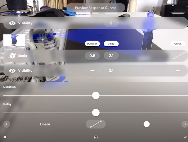
The moment you create an interaction in Torch AR, the timing, delay, and easing curves are all set to a default value. By adjusting these interactions settings through the Edit Curves menu, you can create smooth transitions that gently guide users through your app.
Background
By sequencing your content to appear and animate will help you to break your experience into digestible pieces and establish a comfortable user flow.
Use the Play mode to identify the best length for your reveals if you are animating a reveal. If it’s user-directed, make sure you add a clear call to action to keep users locked in. Test often as you are designing and use this time to make decisions.
Pro-tip #4—Help users visualize their next steps
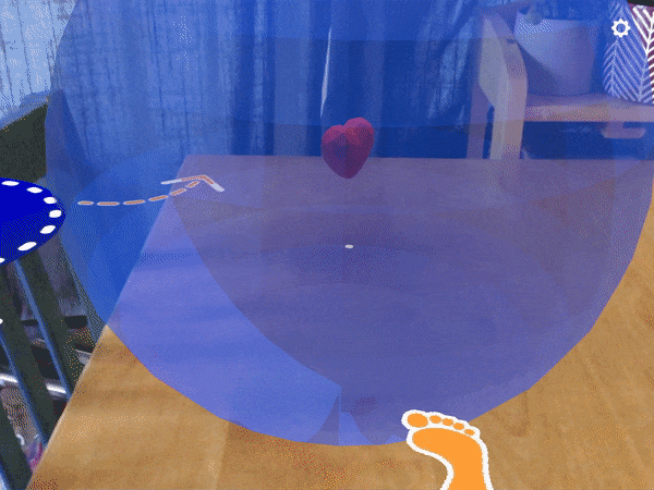
Some features in AR don’t have a direct analog in 2D screen design. So when we introduce these new capabilities that AR provides, we must take extra time and efforts to onboard users to these concepts and interaction patterns.
Background:
During my user testing sessions, I heard that the Gaze-At Triggers in Torch were often confusing to first-time users. Not accustomed to the concepts of “looking at” AR objects through their phone, many users tried to trigger interactions by staring at objects with their biological eyes. So now, when I use the Gaze At trigger, I give users a frame to peer through—visualizing the behavior I want the users to take and that will eventually lead them to success.
When a user needs to tap a trigger, I give them a blinking tap cue. When user needs to fire the Proximity trigger, I show a “walk here” animation. I have built a template called Trigger Visualization that you can access from Torch’s template library. From this template, you can grab these transparent PNG and GIF to use in your own projects.
See these ideas in AR
Now that I’ve shared my tips for AR layout and spatial designs, why don’t you try them for yourself? These Torch Viewer Link apps will work on any AR capable iOS device, just open the link or scan the QR code from your iPhone or iPad camera. I think they’ll help you visualize the AR design concepts, and just maybe, they’ll make you smile with delight.
Join me on the Torch Friends Slack, I’d love to hear what you think about these experiences.
About the author
Maria Nova is an XR Designer from Helsinki. She has worked with both virtual reality (VR) and augmented reality (AR) projects. Most recently her focus has been on mobile AR. Maria is an early Torch user and trainer, leading several user research sessions and AR prototyping workshops for designers and developers.
These early experiences inspire and inform her AR design internship with Torch, building resources that help creatives explore AR foundations while building proficiency using the Torch AR design environment. Find Maria on LinkedIn and Instagram.


